Color Without Confusion — Mastering White Balance and Color Temperature
White balance color temperature becomes easy when you treat it as two controls—Temperature and Tint—used on purpose for accuracy, mood, or both.
If you’ve ever edited a photo that looked “fine” on the camera screen, then turned green indoors or blue in shade, you’ve met the quiet power of white balance color temperature. This post gives you a beginner-safe, repeatable system: how to choose white balance in-camera, how to correct it in Lightroom Classic, and how to stay consistent across a series—without turning color into a guessing game.
What White Balance Actually Controls
White balance is the camera’s (and Lightroom’s) way of answering one question: What color is the light? If the light is warm (tungsten bulbs or golden hour), images shift orange/yellow unless corrected. If the light is cool (open shade or heavy overcast), images shift blue unless corrected.
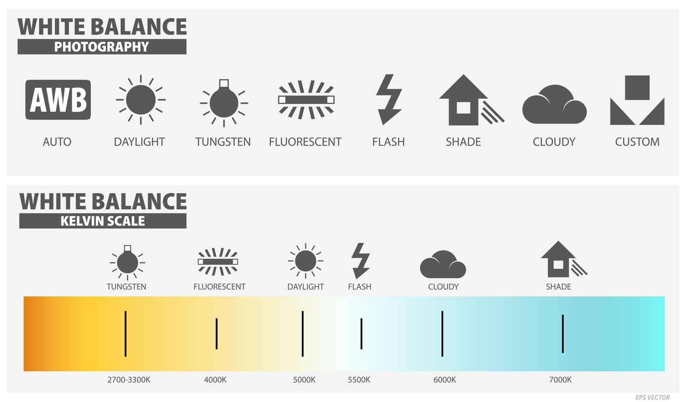
In practice, white balance has two controls:
- Temperature: cool ↔ warm (blue ↔ yellow/orange)
- Tint: green ↔ magenta (often the culprit under LEDs and fluorescents)
Once you understand those two controls, white balance color temperature stops being mysterious. It becomes a tool you can steer.
Why Your Camera Screen Lies (And How to Protect Yourself)
Camera LCDs change their appearance depending on ambient light and brightness settings. A bright screen in sunlight can make photos look darker and cooler than they really are. Likewise, a dim screen at night can make photos look brighter and warmer than reality. Therefore, if you judge white balance by the LCD alone, you’ll chase your tail.
A better habit is to combine (1) a reasonable white balance choice and (2) consistent RAW capture—then refine in Lightroom. You’re building a stable workflow, not trying to win “Perfect Color” in the parking lot.
Beginner-Safe White Balance Choices In-Camera
If you’re shooting RAW, your in-camera white balance is mainly a preview decision. Still, choosing well reduces confusion and gives you a cleaner starting point in Lightroom.
Auto White Balance
Auto WB is a good default for beginners and changing conditions. However, it can shift from frame to frame—especially under mixed light. Consequently, your series may feel inconsistent.
Daylight, Cloudy, and Shade
These presets are excellent when you want consistent warmth outdoors. Shade, in particular, counteracts blue casts and often makes skin tones look healthier. Meanwhile, Cloudy adds gentle warmth without looking artificial.
Tungsten, Fluorescent, and LED Situations
Indoors, start with the closest preset (Tungsten or Fluorescent) to reduce extreme color casts in previews. Then correct precisely in Lightroom using Temperature and Tint. Importantly, LEDs can vary wildly—so treat them as “mixed light” unless you know otherwise.
Mixed Lighting: The #1 White Balance Problem
Mixed lighting happens when two (or more) light sources with different colors hit the scene—think window daylight plus tungsten lamps, or sunset light plus blue shade. The camera can’t “fix” that globally because different areas are lit by different colors.
Use this triage process:
- Identify the dominant light source (what matters most in the frame?).
- Simplify if possible (turn off lamps, move subject, change angle).
- Capture a neutral reference (gray card, or even plain white paper in the same light).
- Accept trade-offs: you may need local adjustments in Lightroom.
The win is not perfection everywhere. The win is control where it matters.
Lightroom Classic Workflow for White Balance Color Temperature
Lightroom makes white balance correction straightforward—if you do it in the right order:
Step 1: Use the WB Selector (Eyedropper) When You Can
If there is a neutral target in the image (gray, white, or black with no color cast), click it with the eyedropper. This often gets you 80% of the way there. Next, refine manually.
Step 2: Temperature First, Then Tint
Adjust Temperature until the scene feels believable. Then use Tint to remove green or magenta bias. In other words, don’t fight tint while temperature is still wrong. Do the big steering first, then the fine alignment.
Step 3: Stabilize WB Before Styling
Apply HSL/Color and Color Grading only after your base white balance is stable. Otherwise, you’ll style a mistake and amplify confusion. Consequently, later edits become harder to manage and harder to reproduce.
Consistency Across a Series
Many photographers don’t struggle with single images—they struggle with consistency. Therefore, build a series method:
- Choose a hero frame, dial in the white balance color temperature, then sync WB to similar frames.
- Group by lighting: indoors, open shade, golden hour, overcast—sync within each group.
- Check skin tones: they reveal WB errors faster than landscapes do.
If you’re unsure, keep it slightly warm rather than slightly green. Green casts are the fastest way to make people look unwell.
Creative White Balance: Mood with Restraint
“Correct” white balance is not always the goal. Sometimes you want atmosphere: winter coolness, late-day warmth, cinematic neutrality, or surreal color tension. The key is to choose intentionally and keep it believable.
- Warm shifts suggest comfort, intimacy, nostalgia, and late light.
- Cool shifts suggest quiet, distance, winter, and reflective tone.
- Local adjustments can solve mixed light without flattening the whole image.
Make small moves, then step away from the sliders. If you can’t stop adjusting, it’s usually a sign the base WB isn’t stable yet.
A Simple Two-Minute Color Audit Before Export
- Check neutrals (whites/greys) for green or blue creep.
- Check skin for unnatural magenta or sickly green.
- Confirm export color space: use sRGB for web and most sharing.
- Trust calibrated viewing when possible (monitor calibration matters here).
Color is easier when it’s repeatable. Repeatable is easier when your process is calm.
Continue in Create → View all Create posts
Jump to: Learn Envision Create
References
Concepts inspired by Adobe Photoshop Classroom in a Book (2025) and PhotoFovea Create workflow standards.
- Associated blog(s): Learn — Lesson 9: The Color of Light: Kelvin, Tint, and Emotion
- Associated blog(s): Create — Lightroom Local Adjustments: Shape Light Fast
📥 Download the White Balance & Color Temperature Checklist (.docx)