Lesson 9 — The Color of Light: Kelvin, Tint, and Emotion
The color of light is never neutral. It shifts constantly—warm at dawn, cool at midday, golden at sunset, and tinted by every lamp, shadow, or cloud it passes through. When you understand Kelvin temperature and tint, you gain technical accuracy and the ability to shape mood with intention.
Learning Objectives
- Define color temperature and understand the Kelvin scale.
- Recognize tint shifts and mixed lighting conditions.
- Use white balance tools for accurate or expressive color.
- Apply warm/cool light choices to support mood and intent.
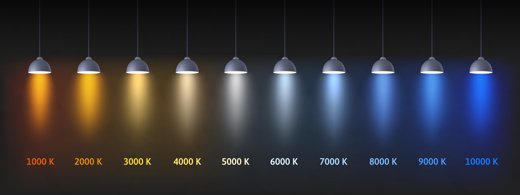
1) The Kelvin Scale — Mapping the Color of Light
The color of light is measured in Kelvin (K). Lower values appear warmer (more orange/yellow), while higher values appear cooler (more blue). Practically, the Kelvin scale becomes meaningful when you connect it to what you see and feel in real scenes.
- 1800–2500K: candlelight, very warm
- 2800–3200K: tungsten lamps, warm
- 5000–5500K: daylight, near-neutral
- 6000–7500K: shade or cloudy light, cool
Rather than memorizing values, learn the pattern: warm light comforts, cool light clarifies, and neutral light documents. Twilight often feels quieter because the light itself is cooler and less direct.
2) Tint — The Hidden Axis
Color temperature describes the blue–yellow axis. However, real-world light often shifts along a second dimension: the green–magenta tint axis. This is why “correct Kelvin” can still look sickly green or oddly magenta.
Common tint contamination sources include:
- Fluorescent lamps → green cast
- LEDs → variable green or magenta shifts
- Mixed lighting → inconsistent hues across the scene
- Open shade lit by sky → cool blue bias (often paired with tint issues indoors)
When skin tones look unwell or neutrals look dirty, tint is often the real culprit.
3) White Balance — Accuracy or Expression?
White balance is how your camera (and Lightroom/Photoshop) interprets the color of light. You can choose accuracy, expression, or a controlled blend of both.
- Auto White Balance (AWB): convenient, but may shift frame-to-frame in mixed light
- Kelvin control: manual consistency (excellent for series work)
- Presets: daylight, shade, tungsten, fluorescent, etc.
- Custom WB: gray card accuracy when you need it
If you shoot RAW, white balance is nondestructive metadata—meaning you can correct it later without harming image data. Still, good in-camera choices reduce confusion and speed up your workflow.
Related reading: Lesson 7 — Histograms & Tonal Mapping
4) Mixed Lighting — Friend or Foe?
Mixed lighting occurs when two or more sources with different color temperatures illuminate the same scene (window daylight + tungsten lamp is the classic example). This can create color conflicts that no single global white balance can “fix.”
- Warm highlights with cool shadows
- Green spill from fluorescent fixtures
- Odd magenta reflections from warm bulbs bouncing off colored surfaces
Use a simple triage approach:
- Choose which light source matters most (what should look “right”?)
- Simplify if possible (turn off a lamp, change position, change angle)
- Capture a neutral reference when feasible (gray card or plain paper in the same light)
- Use local adjustments in post when different areas need different corrections
5) Color as Emotion — Choosing Intentionally
The color of light shapes what viewers feel before they analyze content. Therefore, white balance is not just correction—it’s authorship.
- Warm light → comfort, nostalgia, intimacy
- Cool light → clarity, isolation, stillness
- Neutral light → honesty, documentation, balance
This is why portrait photographers often prefer warm-hour light, while architectural photographers frequently lean toward neutral daylight. Neither approach is “more correct”—it depends on intent.
6) Practical Field Strategies
To control the color of light reliably:
- Use Kelvin WB for predictable consistency when light is stable.
- Use AWB when conditions change rapidly, then normalize in post.
- If a scene is critical, capture one reference frame with a neutral target.
- Watch for tint contamination under LEDs and fluorescents (and correct it deliberately).
Light is never “just” bright or dim—it is always colored with meaning.
Hands-On: The Warm–Cool Experiment
Photograph the same subject three times using manual Kelvin white balance:
- 3000K (warm)
- 5500K (neutral)
- 7000K (cool)
Compare how each choice changes mood, perceived depth, and texture. Notice how “correct” and “expressive” can be different targets.
Quick Check
- What does the Kelvin scale measure?
- Why is tint correction important in mixed lighting?
- How can white balance influence emotional tone?
Glossary
- Kelvin (K)
- A unit used to describe the color temperature of light.
- Tint
- The green–magenta axis of color shift in illumination.
- White Balance
- A camera setting that neutralizes color casts for accuracy or creative intent.
- Mixed Lighting
- A scene lit by multiple sources with different color temperatures.
- Color Temperature
- The perceived warmth or coolness of a light source.
Continue in Learn → View all Learn lessons
Jump to: Learn Envision Create