Preparing a Photo Series for Print: Consistency from Screen to Paper
A cohesive photographic series is not finished until its prints speak the same visual language.
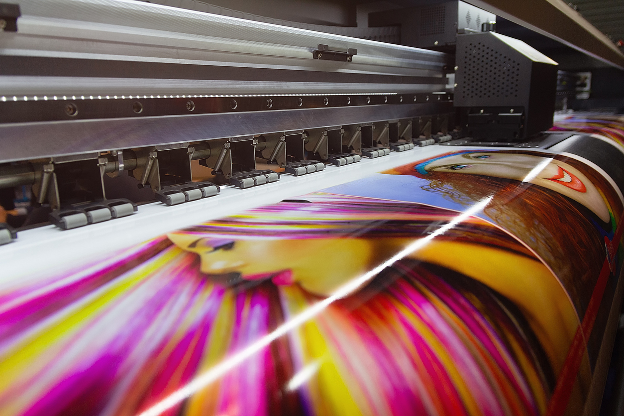
Preparing a photo series for print means carrying the visual consistency established on screen into
a physical body of work. A series may look beautifully unified on a monitor and still lose that cohesion when it reaches
paper. One print may appear darker, another may feel too warm, and a third may contain stronger contrast or sharpening
than anything beside it.
Therefore, preparing a photo series for print requires more than exporting a group of finished files
and sending them to the printer. The photographs must also be evaluated together as physical objects.
Create 21 focused on building consistency across the edited images themselves. Now we carry that visual language into
the print process, where paper, ink, profiles, viewing light, print size, and output sharpening all influence the final result.
1. Preparing a Photo Series for Print Begins With Finished Masters
First, print preparation should begin only after the creative editing of the series is substantially complete.
Each master file should contain the full-resolution image, final retouching, completed color and tonal decisions,
and a non-destructive layer structure whenever practical.
However, the print file should not become the only master. Instead, preserve the creative master and create a separate
output version for each print condition.
A reliable master should include:
- final crop and composition
- completed dust and artifact cleanup
- resolved tonal and color grading
- appropriate local adjustments
- full-resolution image data
- embedded working color profile
- organized non-destructive layers when applicable
This approach protects the creative file while allowing output-specific changes later.
2. Review the Series Before Thinking About Paper
Next, open the completed series together and compare the images under the same display conditions before soft proofing.
Look for visual outliers in brightness, color, contrast, saturation, or shadow density. A difference that felt minor while
editing one photograph may become obvious once the images are viewed as a group.
Ask:
- Does one image appear significantly brighter than the others?
- Does one image have substantially deeper blacks?
- Does one image feel unusually warm or cool?
- Is local contrast consistent with the visual character of the series?
- Does one photograph dominate because of excessive saturation or sharpness?
If genuine inconsistencies appear, correct them at the master-file level before beginning print-specific adjustments.
3. Build the Fine Art Print Workflow Around a Calibrated Display
Color-managed printing depends on a trustworthy display. A monitor profile describes how the display reproduces color
so that color-managed software can translate image values more predictably.
Without a calibrated and profiled monitor, print adjustments can quickly become guesswork.
Even so, calibration does not guarantee that a print will look identical to a screen. A monitor emits light, whereas
paper reflects it. The purpose is not visual identity; rather, the goal is predictable translation from one medium to another.
Workflow checkpoint: If prints consistently emerge too dark, too warm, or too cool, investigate the display
and viewing environment before repeatedly correcting individual photographs.
4. Choose the Print Size Before Final Output Work
Print dimensions influence sharpening, visible detail, viewing distance, and sometimes even the perceived composition.
Therefore, decide the intended image dimensions before applying final output sharpening.
When preparing a photo series for print, also consider whether the photographs should share:
- a common image size
- a consistent paper size
- similar borders
- a shared aspect-ratio strategy
- consistent placement on the sheet
Standardization can strengthen the series. However, it should serve the photographs rather than force every composition
into an unsuitable format.
5. Match the ICC Profile to the Exact Output Condition
A printer profile is meaningful only when it corresponds to the actual printer, ink, and paper combination being used.
In a color-managed workflow, the ICC profile describes how that particular output condition reproduces color.
Consequently, changing the paper changes the output condition and may require a different profile.
When printing through Photoshop with an appropriate profile available, the application can perform the color conversion
for the specific printer and paper combination.
Do not assume that one profile is appropriate for every paper.
6. Soft Proof Every Photograph in the Series
Soft proofing allows you to preview how a photograph is likely to change when translated into the color and tonal limitations
of the intended print condition.
In Photoshop, a custom proof setup can use the profile of the intended printer and paper combination. As a result, you can
evaluate changes in color gamut, paper white, black depth, and overall contrast before ink reaches paper.
The soft proof may appear less luminous than the original image. That difference is expected because paper cannot reproduce
the same brightness range as a backlit display.
Evaluate:
- shadow separation
- highlight detail
- changes in color saturation
- out-of-gamut colors
- paper-white influence
- loss of deep-black contrast
7. Create Output-Specific Proof Adjustments
If a soft proof reveals a problem, avoid overwriting the creative master merely to compensate for one print condition.
Instead, create output-specific adjustments.
These may include:
- a slight mid-tone lift
- improved shadow separation
- small color-balance changes
- selective saturation control
- minor local contrast correction
Keep these changes clearly identified as print-output adjustments so the underlying creative master remains intact.
Pro Tip: Name output layers descriptively—for example,
Print Proof — Matte Paper or Print Proof — Glossy Paper.
8. Maintain Consistent Print Density Across the Photo Series
One of the most important decisions when preparing a photo series for print is controlling print density.
A photograph that looks rich and dramatic by itself may appear excessively dark when placed beside quieter prints.
Conversely, an unusually bright image may visually detach itself from the group.
For that reason, compare the photographs as physical objects whenever possible.
The goal is not equal brightness. A night photograph should remain darker than a daylight photograph. Instead, aim for
a consistent relationship between the intended mood of each image and its printed density.
9. Choose Rendering Intent Deliberately
When colors are converted into the gamut of a printer-and-paper combination, the rendering intent determines how colors
that cannot be reproduced directly are handled.
Two commonly evaluated choices for photographic printing are Perceptual and
Relative Colorimetric.
Rather than assuming one is always superior, soft proof the photograph with both when the difference matters.
Then choose the rendering that best preserves the intended visual relationships within that image.
For a series, consistency of appearance matters more than loyalty to one rendering intent when another produces a visibly
better result for a particular photograph.
10. Avoid Double Color Management
A controlled fine art print workflow should have one system responsible for the color conversion.
If Photoshop is managing color with the selected printer profile, the printer driver should not independently apply
a second color correction. Otherwise, double color management can produce unwanted shifts in color and contrast.
Workflow checkpoint: Before printing, verify both the application settings and printer-driver settings
rather than assuming that a previous configuration is still active.
11. Apply Output Sharpening at Final Print Size
Output sharpening belongs near the end of the print workflow because the required amount depends on image resolution,
print dimensions, subject detail, paper surface, printer behavior, and expected viewing distance.
For example, a textured matte paper may render fine detail differently from a glossy or baryta surface. Therefore, the
same sharpening settings may produce noticeably different visual results.
Apply sharpening to the final print-sized version rather than treating output sharpening as a permanent component
of the creative master.
Across a series, also watch for one photograph appearing noticeably crisper or more brittle than the others.
12. Make Proof Prints Before the Final Edition
Soft proofing is powerful, but the physical proof remains the decisive test. A proof print reveals qualities that the
monitor cannot reproduce directly:
- surface texture
- paper reflectance
- actual black depth
- physical sharpness
- fine tonal separation
- viewing-light interaction
When practical, proof the image at its intended final size. Alternatively, print a representative section at full output scale.
Pro Tip: For expensive fine-art media, a smaller test section containing critical highlights, shadows,
color, and fine detail can identify problems before committing an entire sheet.
13. Evaluate the Proof Under Appropriate Light
Prints do not have a fixed appearance because their appearance depends on the light illuminating them.
For example, a print evaluated under dim, warm household lighting may look different from the same print under neutral
gallery illumination or daylight.
Whenever possible, use a stable and appropriate viewing environment when assessing a body of work. Most importantly,
evaluate every print in the series under the same conditions.
14. Review the Printed Photo Series as a Group
Once proof prints are available, do not judge each one only in isolation.
Instead, lay out or temporarily display the complete set and move your attention across it as a viewer would.
Look for:
- abrupt changes in brightness
- inconsistent black density
- unexpected color shifts
- one print appearing over-sharpened
- one image feeling visually heavier than the others
- inconsistent border or paper presentation
This is the print equivalent of evaluating a photographic series in Grid view. However, the actual output medium is
now part of the judgment.
15. Correct the Outlier, Not the Entire Series
When one print does not fit, resist the temptation to change every file. First determine whether the problem belongs
to that photograph alone.
Perhaps its shadows need slightly more separation. Its dominant color may move out of gamut on the chosen paper, or its
fine detail may require different output sharpening.
Therefore, preserve what already works and correct only what genuinely disrupts the series.
16. Standardize the Final Print Output Files
Finally, once proofing decisions are complete, prepare the final files systematically.
Keep consistent:
- final print dimensions
- resolution strategy
- file format
- embedded color profile
- output sharpening method
- border treatment
- file naming
- version designation
The objective is a repeatable production system. If a print must be recreated later, you should be able to identify
the correct master, output version, paper profile, and print dimensions without reconstructing the workflow from memory.
PhotoFovea Workflow for Preparing a Photo Series for Print
- Finalize the masters: Complete all creative editing before print preparation.
- Review the series: Correct visual outliers before output work begins.
- Confirm display calibration: Work from a trustworthy monitor profile.
- Choose print dimensions: Establish final size and presentation.
- Select the printer/paper profile: Match the actual output condition.
- Soft proof: Evaluate color, density, highlights, shadows, and gamut.
- Create proof adjustments: Keep output corrections separate from the master.
- Apply output sharpening: Sharpen for the final print size and medium.
- Print a proof: Inspect the physical result under appropriate light.
- Compare the series: Judge the prints together.
- Correct outliers: Refine only what disrupts cohesion.
- Produce final files: Standardize and archive the finished print versions.
Hands-On Practice
To practice preparing a photo series for print, select three photographs from a finished series and
prepare them as though they were going to hang together.
- Confirm that the three master files feel visually related on screen.
- Choose one printer-and-paper combination.
- Soft proof all three photographs using the same output profile.
- Identify any image that changes disproportionately under soft proofing.
- Create output-specific adjustments only where needed.
- Size the three photographs for their intended prints.
- Apply appropriate output sharpening.
- Produce proof prints.
- Evaluate the three prints beside one another under the same viewing light.
- Record any final corrections before producing the finished set.
Quick Check
- Are the creative master files complete before print preparation begins?
- Is the monitor calibrated and profiled?
- Have final print dimensions been established?
- Does the ICC profile match the actual printer and paper combination?
- Has each photograph been soft proofed?
- Are output corrections separated from the creative master?
- Has output sharpening been applied at final size?
- Have physical proofs been evaluated under consistent lighting?
- Have the prints been compared as a group?
- Can the finished workflow be reproduced later?
Glossary
ICC Profile: A standardized description of how a device or output condition reproduces color, used by
color-management software to translate color more predictably.
Soft Proof: An on-screen simulation of how an image is expected to reproduce under a specific output condition.
Rendering Intent: The method used to translate colors when moving from one color gamut into another.
Black Point Compensation: A color-management method that helps preserve shadow relationships when converting
between color spaces with different black points.
Output Sharpening: Sharpening applied near the end of the workflow specifically for the final image size,
medium, and viewing condition.
Proof Print: A physical test print used to evaluate color, tone, detail, and presentation before producing
the final print.
Print Density: The perceived lightness, darkness, and tonal weight of the physical print.
Continue in Create →
View all Create posts
Jump to:
Learn
Envision
Create
References
-
Adobe — Photoshop: Print with color management.
Read reference -
Adobe — Photoshop: Proofing colors and custom soft-proof options.
Read reference -
Associated blog:
Editing a Cohesive Photo Series -
Associated blog:
Final Image Workflow for Photographers
🌿
Download the Preparing a Photo Series for Print Checklist (.docx).