Tone Without Trauma — Contrast, Curves, and Dynamic Range Control
Contrast and tone control is not about force—it’s about shaping light deliberately with curves, highlights, and shadows so your images feel dimensional rather than harsh.
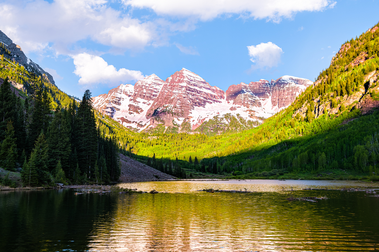
Many photographs struggle not because exposure was wrong, but because contrast was uncontrolled. True contrast and tone control is the art of deciding where light separates, where it softens, and where it rests. When you treat tone as design rather than decoration, your images gain depth without aggression.
Contrast Is Not a Single Slider
The Contrast slider affects the entire image equally. Turn it up and blacks deepen, whites brighten, and midtones stretch. However, real contrast lives in relationships— how shadows transition into midtones, and how highlights hold texture.
Poor contrast control crushes detail and clips highlights. Good contrast and tone control preserves separation while protecting subtle transitions.
Global Contrast vs Tonal Separation
Global contrast treats all tones the same. Tonal separation allows you to work selectively. For example, you may want stronger midtones while keeping highlights gentle. Therefore, shaping tone with intention often means avoiding the global slider altogether.
The Tone Curve — Your Primary Instrument
The Tone Curve is not advanced—it is precise. Unlike sliders, curves allow you to compress or expand specific tonal regions independently.
- Lift shadows without flattening black anchors.
- Protect highlights while increasing midtone presence.
- Create depth that feels dimensional instead of aggressive.
A gentle S-curve often creates presence. A restrained inverted curve can calm high-contrast scenes. Small moves matter more than dramatic bends.
Dynamic Range Is a Design Choice
Cameras capture wide dynamic range; photographers decide how to distribute it. You might compress highlights for serenity or open shadows for intimacy. Neither choice is neutral—each shapes emotion.
Effective contrast and tone control asks: where should the eye settle, and where should it glide?
Layered Adjustments, Not One Big Move
Strong tone is built gradually. Start with a base curve. Then refine with Highlights and Shadows sliders. Finally, use local masks to shape attention selectively.
- Base Curve: establish global mood.
- Highlights/Shadows: recover and balance.
- Local Masks: emphasize or relieve specific regions.
Print-Safe Contrast Discipline
Screens tolerate aggressive contrast; prints rarely do. If an image looks slightly restrained on screen, it will often print beautifully. Preserve shadow detail and avoid crushed blacks if the final destination is paper.
Pro Tips & Common Pitfalls
- Muddy midtones: increase separation, not overall brightness.
- Harsh highlights: compress before adding global contrast.
- Flat images: shape tone with curves rather than forcing the Contrast slider.
Continue in Create → View all Create posts
Jump to: Learn Envision Create
References
Concepts inspired by Adobe Photoshop Classroom in a Book (2025) and Light: Science & Magic.
- Associated blog(s): Create — Exposure Without Fear: Understanding Aperture, Shutter Speed, and ISO
- Associated blog(s): Create — Seeing Exposure: Using the Histogram as a Creative Tool