Lesson 20 — Color Harmony and Visual Weight
Color harmony in photography is not just about beauty—it is about control. Color determines where the eye goes first, how long it stays, and what emotion it carries. When your palette is harmonious, the image feels coherent. When it is not, the frame can feel noisy, even if the subject is strong.
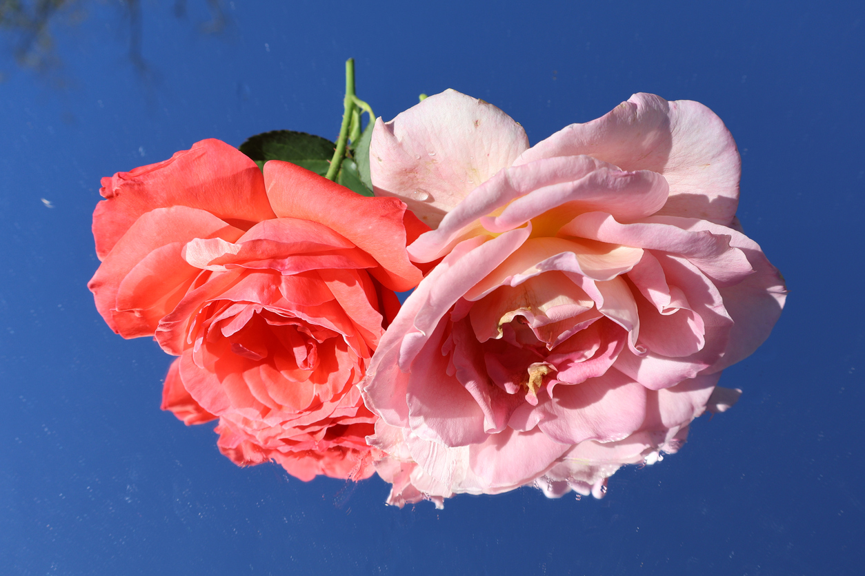
1) Why Color Harmony Matters
Color harmony in photography describes how colors relate across a frame. When those relationships feel coherent, the viewer relaxes. Consequently, attention goes where you intend. When relationships clash, the viewer’s eye keeps searching, and the image can feel unsettled.
Importantly, harmony does not mean “soft” or “muted.” It means that the palette supports the subject and the story.
2) Visual Weight: What Colors Feel Heavy?
Color carries visual weight, even when the colored area is small. A tiny red object can dominate a wide gray scene. Therefore, color is a compositional element, not merely decoration.
Visual weight increases with:
- Saturation: vivid color pulls attention first.
- Brightness: lighter colors often feel heavier than dark ones.
- Warmth: warm hues (reds/oranges/yellows) advance; cool hues (blues/greens) tend to recede.
- Contrast: a color stands out more when surrounded by its opposite or by neutrals.
As a result, color harmony in photography often begins with deciding what color should lead—and what should support.
3) Warm vs Cool: Color as Depth and Emotion
Warm colors often feel closer. Cool colors often feel farther. That perceptual bias can strengthen depth, which connects directly to Lesson 19. For example, a warm foreground against a cool background can create a strong sense of space.
Emotionally, warm palettes can feel intimate, energetic, or nostalgic. Cool palettes can feel quiet, distant, or contemplative. Therefore, temperature is both a depth tool and a mood tool.
4) Two Common Harmonies: Analogous and Complementary
Two palette structures are especially useful:
- Analogous harmony: neighboring hues (blue/teal/green). This usually feels calm and unified.
- Complementary harmony: opposite hues (blue/orange, red/green). This usually feels energetic and dramatic.
In practice, complementary harmony often works best when one color dominates and the opposite acts as an accent. Otherwise, the frame can feel like a tug-of-war.
5) Restraint: The Secret Ingredient
Too many strong colors compete. Consequently, clarity drops. One of the fastest ways to improve color harmony in photography is restraint: choose a dominant palette and reduce distractions.
Field strategies include:
- waiting for cleaner light (golden hour often harmonizes naturally)
- changing angle to remove colorful clutter
- using background separation so the accent color is not surrounded by chaos
Editing strategies include:
- reducing saturation of non-essential colors
- shifting hue slightly toward a unified palette
- using selective masks to control color dominance
6) A Simple “Palette Check” Before You Commit
Before pressing the shutter, ask:
- What is the dominant color story?
- Where is the accent color—and does it support the subject?
- Is anything brightly colored pulling attention away?
- Does the palette match the emotion I want?
As a result, color harmony in photography becomes a conscious decision rather than a surprise.
Hands-On: Two Harmonies, One Scene
- Create one image using an analogous palette (colors close together).
- Create one image using a complementary palette (a dominant color plus an accent opposite).
Keep the location consistent. Change your framing and timing until your palette feels intentional. Then compare mood and clarity.
Quick Check (3 Questions)
- What three factors most increase visual weight in color?
- Why do complementary palettes often work best with one dominant color?
- What is one quick editing move to improve color harmony in photography?
Glossary
- Color Harmony
- How colors relate across a frame to create coherence or intentional contrast.
- Visual Weight
- The pull an element has on attention due to saturation, brightness, contrast, or meaning.
- Analogous Colors
- Neighboring hues on the color wheel that often feel unified.
- Complementary Colors
- Opposite hues on the color wheel that create strong contrast and energy.
- Saturation
- The intensity or purity of a color.
Continue in Learn → View all Learn lessons
Jump to: Learn Envision Create
References
- Cambridge in Colour — Color Theory
- Associated blog: Lesson 19 — Depth Cues: Layers, Focus, and Parallax
- Associated blog: Create — Essential Camera Setup: Universal Best Practices