Color Grading for Photographers: From Correction to Creative Intent
Color grading for photographers is the moment editing moves beyond correction and becomes interpretation—where color begins to shape mood, rhythm, and meaning.
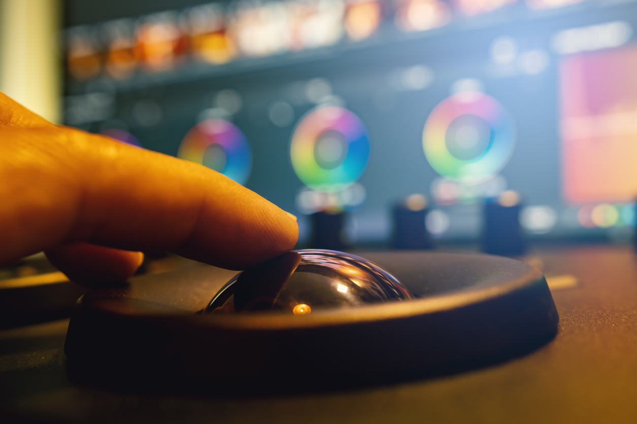
Correction fixes color. Grading gives it a voice.
Many photographers stop once white balance is accurate and skin tones look believable. That is a necessary step, but it is not the end of the color conversation.
Correction restores order. Grading creates interpretation. It is where you decide whether the image should feel quiet, cinematic, luminous, restrained, nostalgic, or coolly precise.
Color grading for photographers is not about forcing every image into a trendy look. It is about making color serve the subject and the emotional logic of the frame.
When done well, grading feels inevitable—as though the image was always meant to carry that atmosphere.
Start with a clean foundation
Creative grading only works well when the file is already stable. Exposure, white balance, and general tonal balance should be corrected first.
If the image is still fighting a color cast, inconsistent highlights, or muddy shadows, grading becomes guesswork.
- Correct exposure and contrast before creative color decisions.
- Set a believable white balance, even if you later shift it for mood.
- Neutralize distracting casts that would interfere with intentional grading.
- Work in 16-bit when possible to preserve smoother transitions.
The real purpose of grading
A good grade does not merely “look good.” It does something specific. It can:
- Shape mood: warm intimacy, cool distance, dramatic tension, soft calm.
- Create harmony: align hues so the image feels visually unified.
- Guide attention: restrain competing colors and strengthen the subject’s presence.
- Establish continuity: help multiple images belong to the same body of work.
Color grading for photographers: a practical workflow
1) Decide the emotional temperature
Before you touch any grading layer, define the feeling you want. Should the image lean warm and welcoming? Cool and distant? Neutral but elegant?
A grade without intent quickly becomes decorative. A grade with intent becomes part of the visual language of the photograph.
2) Identify the dominant color relationships
Look at the image and ask which hues already matter most. Is there a dominant warm/cool contrast? Is one color naturally carrying the emotional load?
Strong grades usually strengthen what is already present rather than inventing something unrelated to the scene.
3) Use Color Balance and Selective Color for tonal shaping
These tools are excellent for controlled grading because they let you shift the shadows, midtones, and highlights independently.
A subtle warm shift in highlights combined with a cooler shadow bias can add sophistication without obvious stylization.
- Use Color Balance for broad tonal color direction.
- Use Selective Color when specific hue families need precise refinement.
- Keep changes small. Strong color moves often feel impressive at first and excessive later.
4) Use Gradient Maps for harmony
Gradient Maps can unify color relationships across the tonal scale in a very elegant way. They are especially useful when you want shadows and highlights
to participate in the same emotional vocabulary.
- Apply Gradient Maps gently and reduce opacity as needed.
- Use blending modes carefully—Soft Light, Color, or Normal at low opacity can all work depending on the image.
- Think of Gradient Maps as tonal color architecture, not a shortcut to “style.”
5) Refine with targeted hue control
Once the broader mood is established, use HSL or hue-targeted tools to refine problem areas.
This is where you calm an overly saturated background color, protect skin tones, or slightly bend foliage, sky, or fabric toward a more coherent palette.
6) Match consistency across a series
A single image can carry a dramatic grade. A series requires restraint and consistency. If you are working on a sequence, compare images side by side.
The issue is not whether every frame is identical, but whether they feel as though they belong to the same visual world.
- Use one or two reference frames as anchors for the series.
- Check consistency in skin, foliage, sky, and neutral surfaces.
- Avoid letting one image become stylistically louder than the rest without a reason.
Non-destructive grading inside a Smart Object workflow
Creative grading works best when it remains fully adjustable. That means building it with adjustment layers above your protected base composite or Smart Object master.
Keep grading flexible so you can revise mood later without touching the underlying retouching or structural edits.
- Base composite or Smart Object master below.
- Global tonal corrections first.
- Creative grading group above, clearly labeled.
- Output sharpening only in export copies, not in the master file.
Hands-On Practice (15 minutes)
- Choose one finished image with strong color potential.
- Create one version graded for warmth and one graded for cooler restraint.
- Use Color Balance or Selective Color for the first pass.
- Add a subtle Gradient Map for tonal harmony if needed.
- Compare both versions and ask which one better serves the subject—not which one feels more dramatic.
Quick Check
- Does the grade support the subject rather than overpower it?
- Do the colors feel intentional and unified?
- Are skin tones or neutrals still believable where they need to be?
- Would this grade still feel appropriate across a related series of images?
Continue in Create →
View all Create posts
Jump to:
Learn
Envision
Create
References
-
Adobe Photoshop Tutorials (reference).
Open -
Adobe Photoshop User Guide — Adjustment layers and fill layers (reference).
Open -
Associated blog:
White Balance & Color Temperature: Color Made Simple -
Associated blog:
Dodge & Burn for Photographers
🌿 Download the Color Grading for Photographers Checklist (.docx).