Editing a Cohesive Photo Series: Consistency Across a Body of Work
A successful photographic series should feel related without making every image look the same.
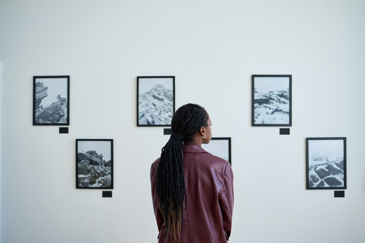
A strong photograph must succeed on its own. A strong series asks for something more: the individual photographs must also
belong together.
Editing a cohesive photo series is therefore not simply a matter of copying the same preset from one image
to the next. Cohesion comes from a shared visual language—similar decisions about tone, color, contrast, emphasis, crop,
texture, and final presentation—while still allowing each photograph to retain its own character.
In the previous Create post, we used editing to strengthen story, mood, and meaning within a single photograph. Now we extend
that thinking across multiple images. Instead of asking only, Does this photograph work?, we also ask,
Does this photograph belong with the others?
1. Define What Holds the Series Together
Before adjusting sliders, identify the visual qualities that make the photographs part of the same body of work.
These may originate in subject matter, light, location, season, palette, point of view, emotional tone, or a combination
of several elements.
The editing process should reinforce those common qualities rather than manufacture similarity where none exists.
Before beginning, identify three things:
- What visual characteristic should remain consistent throughout the series?
- What may legitimately vary from photograph to photograph?
- What emotional or conceptual impression should the completed body of work create?
These answers become your editing compass.
2. Choose a Reference Image
Select one photograph that best represents the intended appearance of the series. This becomes the
reference image.
It does not necessarily need to be the strongest photograph in the collection. It should, however, contain the tonal range,
color treatment, contrast level, and overall mood that most accurately represent where you want the entire series to go.
Finish this photograph carefully before trying to harmonize the remaining images.
Evaluate the reference image for:
- overall brightness
- black and white points
- mid-tone contrast
- shadow openness
- highlight restraint
- color temperature
- saturation level
- local contrast
- crop and aspect ratio
- degree of sharpening and texture
3. Synchronize the Foundation, Not the Finished Image
Lightroom Classic makes it possible to synchronize selected Develop settings across multiple photographs.
This can be extremely useful when a group of images was created under similar lighting or camera conditions.
The important distinction is between synchronizing a starting point and forcing every photograph
into an identical final treatment.
Settings such as profile choice, baseline color treatment, lens corrections, or a shared tonal direction may transfer well.
Exposure, local masks, highlight recovery, and subject-specific adjustments often require individual refinement.
Pro Tip: Synchronize only the settings that truly belong to the entire series. Then fine-tune each photograph individually.
4. Match Tonal Character Before Exact Brightness
Two images do not need identical histogram shapes to feel visually related.
A bright photograph and a dark photograph may still belong in the same series if they share a consistent tonal philosophy.
For example, both may preserve deep but readable shadows, restrained highlights, and moderate mid-tone contrast.
When comparing images, pay attention to the character of the tones rather than trying to match numerical exposure values.
Ask:
- Are the blacks similarly deep or open?
- Are highlights equally restrained or luminous?
- Do mid-tones have a comparable sense of density?
- Does one photograph suddenly appear much harsher or flatter than the others?
5. Establish a Consistent Color Language
Color is one of the fastest ways for a series to gain—or lose—cohesion.
Consistency does not require identical white balance. A sunset image may naturally be warmer than an overcast scene.
Instead, look for a shared approach to color.
Perhaps the series favors muted saturation, restrained greens, warm highlights, cool shadows, or a limited palette.
Those relationships can remain recognizable even as individual scenes change.
Photoshop adjustment layers are particularly useful when the final color treatment needs more selective control.
Curves, Color Balance, Selective Color, Hue/Saturation, and other adjustment layers allow tonal and color refinements
without permanently altering the underlying pixels.
Workflow checkpoint: View several finished images together. If one photograph immediately feels unusually warm, cool, saturated, or neutral, determine whether that difference serves the series or disrupts it.
6. Keep Contrast Consistent With the Series
Contrast has a visual accent just as color does.
One highly dramatic photograph placed among a group of quiet, low-contrast images can dominate the entire sequence.
Conversely, a flat image can feel unfinished beside photographs with stronger separation and depth.
Compare global contrast, but also examine local contrast and edge intensity. Texture, clarity, sharpening, and selective
dodging and burning can substantially change how forceful an image feels.
The goal is not uniformity. The goal is proportionality.
7. Control Local Emphasis
Every photograph contains a visual hierarchy. Across a series, the strength of that hierarchy should feel intentional.
If one image contains aggressive local brightening, strong edge contrast, or unusually saturated subject color,
it may command far more attention than neighboring photographs.
Use masks, dodging and burning, and selective contrast to guide the eye—but judge those decisions in relationship to the
other photographs, not only within the single frame.
Pro Tip: Temporarily reduce the size of your thumbnails or use a grid view. At smaller scale, inconsistencies in brightness, color, and visual emphasis often become much easier to see.
8. Make Cropping Part of the Visual Language
Cropping affects more than composition. It determines rhythm across the series.
A group of photographs may benefit from a common aspect ratio, particularly when intended for a gallery wall,
portfolio sequence, book, or print collection. In other cases, varying orientations and dimensions may strengthen the work.
Either approach can succeed if it is deliberate.
Consider:
- Does the series favor horizontal, vertical, square, or mixed framing?
- Are subjects generally given similar breathing room?
- Do horizon placements and negative spaces create a recognizable rhythm?
- Would one unusual crop feel purposeful—or accidental?
9. Edit the Series in Conversation With Itself
A common mistake is to finish each photograph independently and only later discover that the collection lacks cohesion.
Instead, move repeatedly between the individual image and the group.
- Finish the reference photograph.
- Bring a second photograph into visual alignment.
- Compare both at the same viewing size.
- Add a third photograph.
- Reassess all three together.
- Continue building outward while making small corrections to earlier edits when necessary.
The series itself becomes a feedback system.
10. Sequence Before Declaring the Edits Finished
Sequencing can reveal problems that isolated editing hides.
Place the photographs in their likely presentation order and look for abrupt visual jumps. One image may suddenly appear
too bright. Another may feel excessively cool. A third may have stronger contrast than anything around it.
These differences are not automatically errors. Sometimes they create necessary pacing.
The question is whether the transition feels intentional.
11. Preserve Individuality
Cohesion becomes counterproductive when every image begins to look processed through the same template.
A photograph made in soft fog should not necessarily have the same contrast as one made in hard sidelight.
A warm dawn may need a different color balance from a blue-hour photograph.
The shared visual language should unite the photographs without erasing the conditions that made each one worth photographing.
Consistency is not sameness.
12. Standardize Final Output
Once the creative editing is complete, output consistency becomes essential.
Photographs within the same finished series should follow a deliberate approach to:
- pixel dimensions or print dimensions
- resolution
- color space
- output sharpening
- file naming
- border treatment, when applicable
- print paper or display medium
A cohesive edit can be undermined by inconsistent output preparation. Treat the final files as a collection, not merely
as a folder of unrelated exports.
PhotoFovea Series Workflow
- Define the series: Identify its central visual and emotional characteristics.
- Select the reference: Finish one representative photograph carefully.
- Establish the baseline: Synchronize only appropriate shared settings.
- Refine individually: Correct exposure, masks, and local emphasis image by image.
- Compare continuously: Judge photographs beside one another, not only alone.
- Sequence: Arrange the images and evaluate visual transitions.
- Rebalance: Correct outliers in tone, color, contrast, or emphasis.
- Standardize output: Apply a consistent final-delivery workflow.
Hands-On Practice
Choose five photographs that you believe belong together.
- Select one as the reference image.
- Write down the tonal, color, and contrast characteristics that define its appearance.
- Edit the remaining four images using those characteristics as guidance.
- View all five together in Lightroom Grid view or an equivalent multi-image display.
- Identify the photograph that feels least connected to the group.
- Determine whether the problem is tone, color, contrast, crop, local emphasis, or the photograph itself.
- Make only the changes necessary to strengthen the relationship.
If an image still does not belong after thoughtful editing, consider removing it rather than forcing it into the series.
Quick Check
- Can you describe the visual language of the series in one or two sentences?
- Is there a clear reference image?
- Are tone and color related without being mechanically identical?
- Does one image dominate because of excessive brightness, contrast, saturation, or detail?
- Do cropping and aspect ratios feel intentional?
- Have you evaluated the photographs as a sequence?
- Are the final output settings consistent?
- Does every photograph still retain its individual character?
Glossary
Reference Image: A representative photograph used as the visual benchmark for editing the remainder of a series.
Visual Language: The recurring combination of tonal, color, compositional, and stylistic choices that gives
a body of work its recognizable character.
Tonal Character: The overall relationship among shadows, mid-tones, highlights, and contrast within an image.
Synchronization: Applying selected editing settings from one photograph to additional photographs as a shared starting point.
Visual Hierarchy: The relative order in which elements attract and hold the viewer’s attention.
Sequencing: Arranging photographs in an intentional viewing order so that relationships, transitions, and pacing support the body of work.
Continue in Create →
View all Create posts
Jump to:
Learn
Envision
Create
References
-
Adobe — Lightroom Classic: Develop module options and synchronizing settings across multiple photographs.
Read reference -
Adobe — Photoshop: Create adjustment layers for non-destructive tonal and color editing.
Read reference -
Associated blog:
Visual Narrative in Photography -
Associated blog:
Final Image Workflow for Photographers
🌿
Download the Editing a Cohesive Photo Series Checklist (.docx).